In this form you can define what shall happen when user click a Quick button. The form contains a list of items corresponding to the selection in Set dimension of Quick buttons. For example, if you have selected a 1x3 matrix (1 row, 3 columns) the list contains “Title 1x1”, “Title 1x2” and “Title 1x3”.
Click one of the items, a number of fields will be displayed for defining the Quick button:
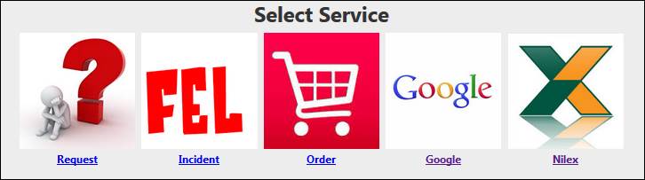
•Select files: Select image file for the Quick button icon. Icon is displayed as 100x100 pixels. You can user other image sizes, system will adjust to a 100x100 pixels image. However, try to use square images (same height and width). If not the image is misrepresented after adjustment.
•Title: The title text below the icon.
•Function Type: Dropdown list. Select EndUserForm or UrlLink.
•The last field is dependent of the selection in Function Type. If EndUserForm is selected this dropdown contains available forms in the system for End User to submit a ticket. If UrlLink is selected you have to define the address to the website to be opened, e g “www.nilex.se”.
Repeat for all items in the matrix and click Ok to save the buttons configuration and return to the widget form.
If you need a configuration in other language, select language in the widget form, insert Title for the new language, and repeat the configuration to insert Titles for each Quick button in the selected language.
For EndUserForm the form will be opened in the current tab and the Quick buttons widget will be closed. The UrlLink website is opened in a new tab and the current tab remains intact with the Quick buttons displayed.
Note that you can define only one Quick buttons widget for each tab in the Self Service Portal. If you want to define a new Quick buttons widget for a tab you have to delete the old one first, if you don’t, the tab is not selectable in Widget displayed on tab field in the widget form.
Quick buttons 1x5 widget example