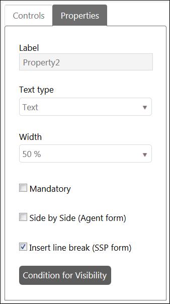
When you click Edit Properties button for any control, you will see Properties section on left side where you can edit the Properties of that control:
Control Properties
The properties can vary based on the type of the control. Generic properties displayed for all controls except Comment Control are: Label, Width and Side by Side as shown in the above figure:
•Label field displays label of a control and it cannot be edited except for Add New Field and Group controls. You can define localized value for label while adding these controls but it cannot be changed once the form is saved.
•Width field is used to set the width of a control.
•Mandatory. Enable checkbox if property should be mandatory (value must be entered) in form.
•Side by Side (Agent form) field is used to define whether a control should be displayed beside another control or not. Note that two controls can be displayed beside each other at most and this field must be enabled for both controls. Note that this setting affects only Agent forms, for End User forms on Self Service Portal you can use Insert line break property, see below.
•Insert line break (SSP form). If this checkbox is enabled for a field in form there will be a line break after the field and next field will be displayed on next row. Note that this property only affect forms on Self Service Portal (End User forms). For Agent forms this functionality is controlled by the Side by side property.
Image and HTML Controls only have Label field in their properties section.
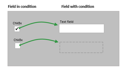
You can also Set visibility condition. This means that you construct a condition that needs to be fulfilled in order for the field in question to be shown. You can create conditions with other fields that reside on the same form that you are currently editing.
•You can create conditions on all field types except Position and Comment.
•You can only use the field types Checkbox or Combobox in a condition. For example if a specific checkbox is chosen (=Condition) the textfield with this condition set will be shown.
Add New Field, Comment, Number, Double, Radio Button and Text controls have other properties:
Add New Field
Add New Field control has additional properties; Control Type and Mandatory. You can choose the type of the control and define respective property. You can also define that whether a newly created field is mandatory or not.
Radio Button
An additional button Radio Button Items is available for Radio Button control to define the Items to be displayed as options. Clicking this button opens a popup where you can add item, remove item, modify item text and define localized values for items. After doing the changes, you click Close button to close the popup and save the settings.
Comment
Comment control has following three properties:
•Allow switch Internal/Public: You can check this option to allow users to convert internal notes to public notes or vice versa in comments. If this is enabled, internal note icon will be displayed in public comment to convert it to internal note and public note icon will be displayed in internal note to convert it to public reply.
•Allow Mark as Solution: You can check this option to allow users to mark comment as a solution. If this is enabled, Mark as a Solution icon will be displayed in the comment.
•Allow mark as Workaround: You can check this option to allow users to mark comment as a Workaround solution. If this is enabled, Mark as a Workaround icon will be displayed in the comment.
Number and Double
Number and Double controls have following three additional properties along with generic properties:
•Min: You can define minimum allowed numeric or double value of the control.
•Max: You can define maximum allowed numeric or double value of the control.
•Step: You can define the value of a step by which the value of the field gets incremented or decremented when user clicks on Increase or Decrease button respectively.
Text box
An additional field Text Type is available for Text box control using which you can define the type of text field from the available options like Text, Email, Url, IPAddress4, IPAddress6, Mac Address, Mobile number, Phone number, Zip code and Text with barcode prefix. Selecting some of the options like Mobile number, Phone number and Zip code displays an additional field “Mask” where you can define the masking value of the property. Also, Selecting last option “Text with Barcode Prefix” displays an additional field “Prefix” where you can set prefix value of the field.