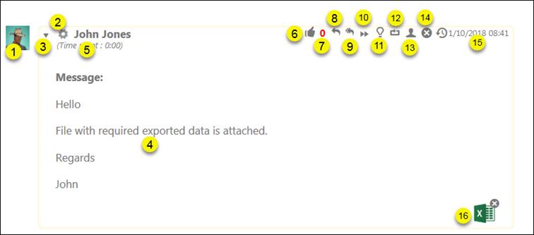
Each item in the comment list contains various fields:

Comment Item
All the fields in the comment item are labeled in the above figure and explained in the list:
1. Profile picture of the user who posted the comment.
2. Source Icon from where the comment is posted. It can be System, Email, Chat, etc.
3. The arrow icon is used to collapse/expand the comment detail.
4. The comment details show the actual comment text.
5. This shows the time spent to write a comment which is recorded by the comment timer. This field is only displayed if comment timer is enabled.
6. Like button. You can click this button to like the comment (for comments you have not written yourself).
7. Shows the number of likes made to the comment by other users.
8. Reply email. Opens form to reply email to user that added the comment. Recipient, Subject (ticket id+subject), email header and comment text is filled in the form. You can edit all data, e g add more recipients, and add your reply message before sending the email. You can attach files to the email and/or you can use checkboxes to attach files that already exists connected to the ticket or comment, select Include ticket attachments or Include comment attachments. Third checkbox, Add as public comment, adds a new Public comment containing the email content. If checkbox is not activated, an Internal comment is added.
9. Reply to all. Function is similar to Reply above, but all recipients (also CC recipients) of the comment email are pre-selected as receivers of the reply email.
10. Forward email. Opens form to forward the comment as email message. All functions are similar to Reply email, see 8 above, except that email recipient field here is empty. You have to select one or more recipients for the email.
11.
This option is used to mark a comment as a solution. Comment is assumed to
describe a solution useful in resolving the ticket. Comment is displayed with
green border (Internal comment) or green background (Public comment). For
solution comments an extra button,  is shown in the rows of buttons in
upper right corner. Button is used to create a KB Article containing the comment
text (and other ticket data). See Add article from ticket.
12. This option is used to mark a comment as a work around solution. Comment is assumed to describe a work around useful in resolving the ticket. If the comment is marked as a work around then it is displayed with blue border (Internal comment) or blue background (Public comment).
13. An option to change public comment to internal or vice versa.
14. Delete comment. This function is available only if user has got permission to delete comments. Confirm question is shown in popup before deletion.
15. Shows the date and time when the comment was submitted.
16. Shows a thumbnail of the attachment. Clicking it opens the file. Each thumbnail icon could have a x button, used for delete the attachment (delete option is controlled by system permissions).
If incoming comment was posted by Email sender and all recipients is displayed in the header of the comment item:

Incoming email comment
For outgoing email comments (Direct mail) comment item header contains email source icon, sender and all recipients of the email:

Direct email comment item header