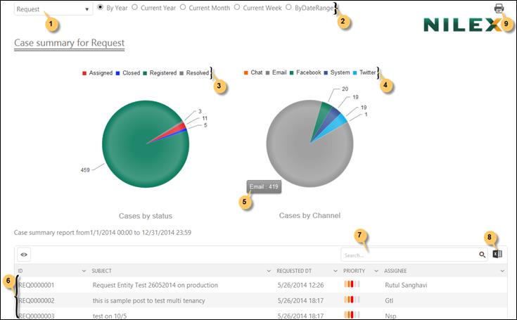
Helpdesk Overview (Pie Chart) report shows the graphical representation of the same data as Helpdesk Overview (Bar Chart) (Helpdesk Overview (Bar chart)). This report uses pie graph to plot the data:

Helpdesk Overview (Pie chart)
From the dropdown list (1) you select the ticket type and from the date filter (2) you select the time interval for which you want to generate the report. Date filter is described in General features.
Two pie graphs are shown: Tickets by Status (3) and Tickets by Channel (4).
The statuses/submission channels represented in the graph are labeled just above the graph. You can click on any of the status/submission channel to show or hide the related data in the graph.
All tickets filtered for the date interval are initially displayed in the list below the graph (6). The list provides a search box (7) and an export to excel button (8).
When you mouse over any pie sector, a small label is displayed besides it showing the total number of tickets represented by that sector (5). Clicking a sector filters the list to show only tickets included in that sector. The other graph (the one you not clicked) is updated, showing only tickets represented by the clicked sector.
Use Print button (9) to open the print utility. You can do required changes and make a print out of the report.