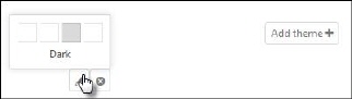
Default theme cannot be edited or deleted, but if you mouse over a theme that is not the Default theme, two buttons, Edit and Delete are displayed. Click Edit to open Theme Builder to edit the theme.
You can open Theme Builder to add a new theme by the Add theme + button.
Start Theme builder

Theme Builder
When this form is shown, the NSP theme builder panel is not displayed. To open this panel, you need to click Launch Theme builder button available on the top left corner of the theme builder form. This form contains different types - UI controls used:
•UI Controls: The UI Controls here include Menu, Grid, Tab Strip, Panel Bar, Pickers, Sliders, Tree View, Button, Tooltip, Upload, Calendar and Splitter. All the controls have different properties. Based on the properties, all the controls are grouped internally by the theme builder to customize them.
•NSP Theme Builder Panel: When you launch the theme builder, the panel containing the categories button is shown. Right now we have only one category in the NSP that is Web. You need to click on that “Web” button so the theme builder panel as shown in the above figure will be displayed.
•This panel contains the four main components: UI controls’ properties grouped by different categories, Back button, Get CSS button, and Reset button. All these components have different functionality to perform.
o The UI control properties are categorized into different groups by NSP to apply customizations on the controls. These groups include: Dashboard Top Navigation, Dashboard Left bar, End User Portal, Widgets, Headers and Links, Buttons, Groups and content areas, Inputs, Pickers and select boxes, Widget states, Tooltips, Validation, Drag Handle and Misc.
o All the groups are displayed in the list can be expanded to see the properties under that group. For example, Top navigation group has Background Color, Icons Color and Icons Background Color under it. When you select or enters any value for any field in the Theme Builder Panel, the respective changes applies to the respective controls available in this form. All the different properties are described in the table below.
o Thus, you can select the different values for the different groups and customize the various UI controls.
o Back button is used to go back to the previous panel state.
o Get CSS button is used to generate CSS styles based on the properties set by user in the theme builder and save the theme. The theme with this CSS can be saved to the NSP for later use.
To reset or clear all the customizations done on the controls, Reset button is used.
Back button is also available beside Launch Theme Builder button.