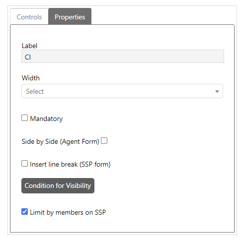
When you click Edit Properties button for any control, you will see Properties section on left side where you can edit the Properties of that control:
Control Properties
The properties can vary based on the type of the control. Generic properties displayed for all controls except Comment Control are: Label, Width and Side by Side as shown in the above figure:
•Label field displays label of a control and it cannot be edited except for Add New Field and Group controls. You can define localized value for label while adding these controls but it cannot be changed once the form is saved.
•Width field is used to set the width of a control.
•Mandatory. Mandatory. Enable checkbox if property should be mandatory (value must be entered) in form and property is marked with an asterisks *.
When Mandatory checkbox is enabled, multiselect field Mandatory stages are displayed just below. Using this field, you can set ticket stages on which this field value is mandatory. In this case, the property is marked with two asterisks **.
Additionally, for the "Assignee" field, there are two stages:
•Mandatory Stages Group: Here, you can select all status phases where a minimum group assignment is required in the "Assignee" field.
•Mandatory Stages Agent: Here, you can select all status phases where a specific agent assignment is required in the "Assignee" field.
•Side by Side (Agent form) field is used to define whether a control should be displayed beside another control or not. Note that two controls can be displayed beside each other at most and this field must be enabled for both controls. Note that this setting affects only Agent forms, for End User forms on Self Service Portal you can use Insert line break property, see below.
•Insert line break (SSP form). If this checkbox is enabled for a field in form there will be a line break after the field and next field will be displayed on next row. Note that this property only affect forms on Self Service Portal (End User forms). For Agent forms this functionality is controlled by the Side by side property.
•Limit by members on SSP. If this checkbox is selected for a system and custom CI reference field the user will be given the option of displaying a limitation of CIs on the Self Service Portal. Upon opening SSP and clicking Assets and choosing System views (left panel) and selecting CIs from membership after further expanding the dropdown menu, the user is shown a list of CIs where the user is assigned as a member of.
This option also affects the creation of new tickets in the Self Service Portal displaying only CIs where property Members value is a membership level scope where the user belongs to the same membership level.
Image and HTML Controls only have Label field in their properties section.
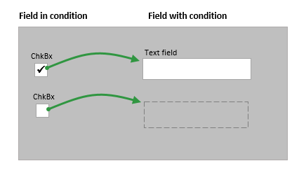
You can also set Condition for Visibility. This means that you set a condition that needs to be fulfilled in order for the field in question to be shown. You can create conditions with other fields that reside on the same form that you are currently editing.
•You can create conditions on all field types except Position and Comment.
•You can only use the field types Checkbox or Combobox in a condition. For example if a specific checkbox is chosen (=Condition) the text field with this condition set will be shown.
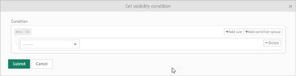
The visibility condition for End User and Anonymous forms is built of a logical hierarchical structure of Conditions and Sub conditions. The different conditions are linked by operators And (AND operator) and Or (OR operator). You can select And to require match of all the linked conditions, or Or if match any single condition from the linked conditions defined is enough. The order is approved only if the result of the complete logic expression is true.
The section is initially displayed with one empty condition row, Add condition and Add sub condition buttons, Delete button and operator selection And/Or.
Add New Field, Comment, Number, Double, Radio Button, Reference and Text controls have other properties:
Add New Field
Add New Field control has additional properties; Control Type and Mandatory. You can choose the type of the control and define respective property. You can also define that whether a newly created field is mandatory or not.
Radio Button
An additional button Radio Button Items is available for Radio Button control to define the Items to be displayed as options. Clicking this button opens a popup where you can add item, remove item, sort items, modify item text and define localized values for items. You can also move the radio button items by drag and drop. After doing the changes, you click Close button to close the popup and save the settings.
Combo select
An additional button Combo box Items is available for Combo select control to define the Items to be displayed as options. Clicking this button opens a popup where you can add item, remove item, sort items, modify item text and define localized values for items. You can also move the combo select by drag and drop. After doing the changes, you click Close button to close the popup and save the settings.
Data tree
An additional button Data tree Items is available for Data tree control to define the Items to be displayed as options. Clicking this button opens a popup where you can add Parent item, add Child item, remove item, sort items, modify item text and define localized values for items. You can also move the data treen items by drag and drop. After doing the changes, you click Save date tree items button to close the popup and save the settings.
Comment
Comment control has following three properties:
•Allow switch Internal/Public: You can check this option to allow users to convert internal notes to public notes or vice versa in comments. If this is enabled, internal note icon will be displayed in public comment to convert it to internal note and public note icon will be displayed in internal note to convert it to public reply.
•Allow Mark as Solution: You can check this option to allow users to mark comment as a solution. If this is enabled, Mark as a Solution icon will be displayed in the comment.
•Allow mark as Workaround: You can check this option to allow users to mark comment as a Workaround solution. If this is enabled, Mark as a Workaround icon will be displayed in the comment.
Number and Double
Number and Double controls have following three additional properties along with generic properties:
•Min: You can define minimum allowed numeric or double value of the control.
•Max: You can define maximum allowed numeric or double value of the control.
•Step: You can define the value of a step by which the value of the field gets incremented or decremented when user clicks on Increase or Decrease button respectively.
Reference
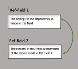
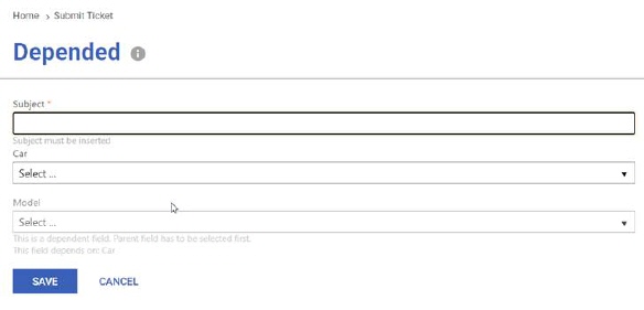
An additional button for reference fields but only for End User and Anonymous forms is Add Depended field.
The button is used to create a dependency between two reference fields. This means that the choice in one field filters what is shown in the other field. You make the dependency setting in the field where you make the choice, not in the field that is filtered. This means that each reference field can only have one field that has another field dependent of it.
|
|
Prerequisites: • Both reference fields that are to be dependent of each other must be created •Both fields must be on the same “level” in the Entity type structure.
|
Example:
An example is that you want to limit the selection of car Models available in a Models field depending of what Car is chosen.
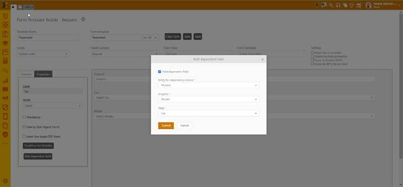
Add dependent field is activated, which means that another field is depending on the value chosen in this field (Car). In this case, what is shown in, the field Model is limited of the property Value “Car”.
Text box
An additional field Text Type is available for Text box control using which you can define the type of text field from the available options like Text, Email, Url, IPAddress4, IPAddress6, Mac Address, Mobile number, Phone number, Zip code and Text with barcode prefix. Selecting some of the options like Mobile number, Phone number and Zip code displays an additional field “Mask” where you can define the masking value of the property. Also, selecting last option “Text with Barcode Prefix” displays an additional field “Prefix” where you can set prefix value of the field.
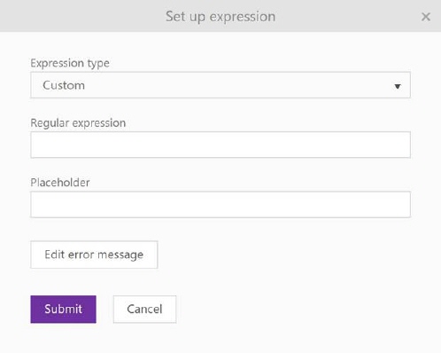
Another additional option for Text Type filed is button Set up expression. Note that this button is available only for End User and Anonymous forms.
This button is use if you want to set the regex validator to a certain text field type, it can be done by clicking the Set up expression button, after which a popup will open where you can enter the regex values. It is necessary to select expression type. If you want to enter your manually defined regex, select a custom type, or for already predefined expressions from the system select from the list (Swedish personal number). In the case of a custom expression, you need to enter a regex value for the validator. Also, you can set a placeholder text on the field. You can also set messages for the user, in case of invalid data entry on the form.
Set up REGEX
Translation
If you use several languages in your system you must see to it to all field names, any choices and field content have proper translations.
HTML text
If you have an HTML text property, it is possible to set the property as read-only (info field), where the value of the property will be displayed without the possibility of editing. This option only exists on the Self Service Portal.