Just above list of themes is button Add Theme used to create new theme. Selecting this button opens Theme editor.
Theme editor
Theme editor form offers possibility of defining theme Name, colors for Main color, Accent Color, Primary text color, Secondary text color, Non text color, Header text color, Footer background color, Footer text color, Full width layout, Background opacity and Background type. Color is selected by clicking respective color box. This opens a popup containing a color picker.
Form also show a window with simple preview.
If checkbox Full width layout is activated will system use full screen to view forms and widgets. Below images shows SSP layout with Full width layout activated/not activated:
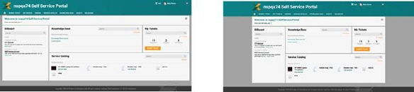
Full width layout activated/not activated
All fields are required.
Background type can be:
•Solid color: Color is set using standard NSP color picker.
•Custom image: If you select this alternative a field is shown below the dropdown, clicking this field opens a file browser where you can select file containing the image.
Content background opacity is setting for image opacity, 0-100 % SSP content transparency to adjust background visibility through the content forms.