Pivot table is a summary report where all selected properties are rows and columns. The number of objects meeting the property in both row and column is displayed in the cross points. The report answers questions like “How many tickets with different Priorties are assigned to a Handler”
Pivot table basic example:
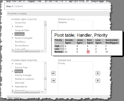
In the figure “Basic Pivot table” you can see that Agent “Kent” is assigned 11 tickets with priority “Medium”.
Figure: Basic Pivot table
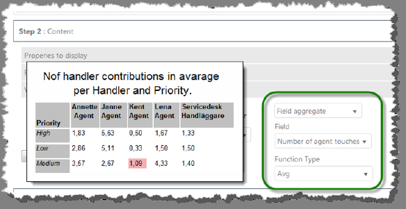
You can insert calculations in the cross points using the Field aggregate function. Example: “How many times is a ticket with Priority X by Agent Y handled in average?”
In the figure “Calculated values” below, shows a setting that creates a report where you can see that Agent “Kent” handles his tickets with Priority “Medium” in average 1.09 times.
The table below describes different selections you can do in Content section when report type Matrix Report has been chosen.
|
Properties to |
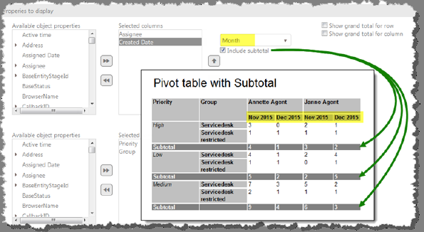
Select data objects for the axis (columns and rows) in the Matrix Report. You can choose properties from the selected data object. You can select maximum 2 columns (upper list) and 3 rows (lower list). You can change the order of columns and rows respective by using the arrow buttons right of the lists. If you select a property of data type Date, you will get a possibility to group values by Day/Month/Year. Include subtotal: This checkbox is available if you have selected 2 properties in Selected columns. If you check this, a summary for the “latest” property will be calculated and displayed in the report, See figure “Subtotals and date settings”. If you check Show Row Grand Total (or Show Column Grand Total), an extra column (or row) is inserted to the right (or in the bottom) of the matrix, where summary for each row (or column) is displayed. |
|
Figure: Subtotals and date settings | |
|
Filter options |
Find specific data and define filter to limit which items to display in the report. Filter function is described in section Report Filter. |
|
Value setting |
Interval coloration–Here you can define display color for values in different intervals. Values inside the interval will be displayed in selected color. Value Calculations – First select a field containing numeric data. Then you get a possibility to define a calculation for the value in the cross point. Note! The properties you select to do the calculation on is not automatically printed out in the report. A suggestion is to write this information in the Report Header. Example of Value Calculations is shown in the beginning of this section. |
Read more: